Colour in advertising and promotion is uniquely important because its the first thing you see, so vibrancy and originality is massively important to achieve the general publics attention. Death Grips have always stood out to in these regards, with their interesting approach to concert posters.
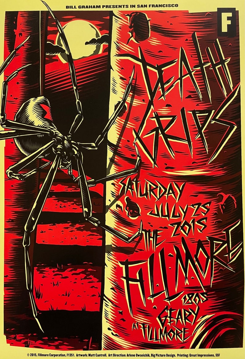
Death Grips are an experimental, industrial hip-hop trio. Originating from Sacramento, California; the group have been somewhat active since 2011. This poster is from an early Death Grips gig in San Francisco. Red is notorious with rage and anger being specifically chosen here to not only reflect the Death Grips themes but to bright and eye catching. The vibrant red forces you to take a closer look, where you’ll find the imagery and text. Within the poster they also use a pale yellow colour which contrasts with the red very nicely. This is because on a colour wheel red and yellow are both close to each other as well as being primary colours.
Yellow being used as a background to the red colouring is very important because lighter colours as backgrounds make the foreground look bigger and bolder. In addition, yellow is a very warm and kind colour making the aggressiveness of the red slightly more subtle.
Finally, black is used to outline and shade. Heightening the bold intensity of the poster and giving an almost comic book/ graphic novel aesthetic. I think this poster uses colour in a very simple way, but very effectively. I personally don’t like the “over-use” of colour, so this piece really stands out to me as it only uses two primary colours and in an extremely unique way. When adapting and improving the next piece, I want to focusing on minimalism while having an interesting selection of colour, as well as, using the colour wheel to decide which colours to use.
Redesign.
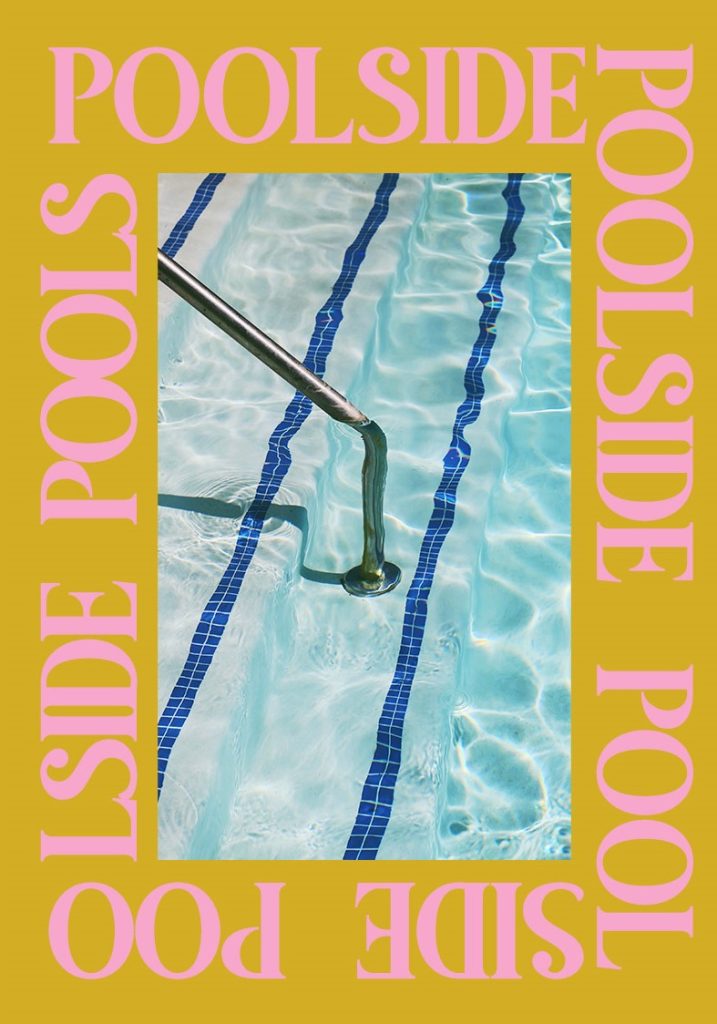
I found this poster on the right by the designer Laura Misuraca posted on Behance. I actually really like this design, despite the awful colouring. The mixture of pink text and a yellow background is jarring to look at, it is almost psychedelic. In any case, it is still incredibly difficult to read and many people simply will not be able to read the text ‘POOLSIDE’.
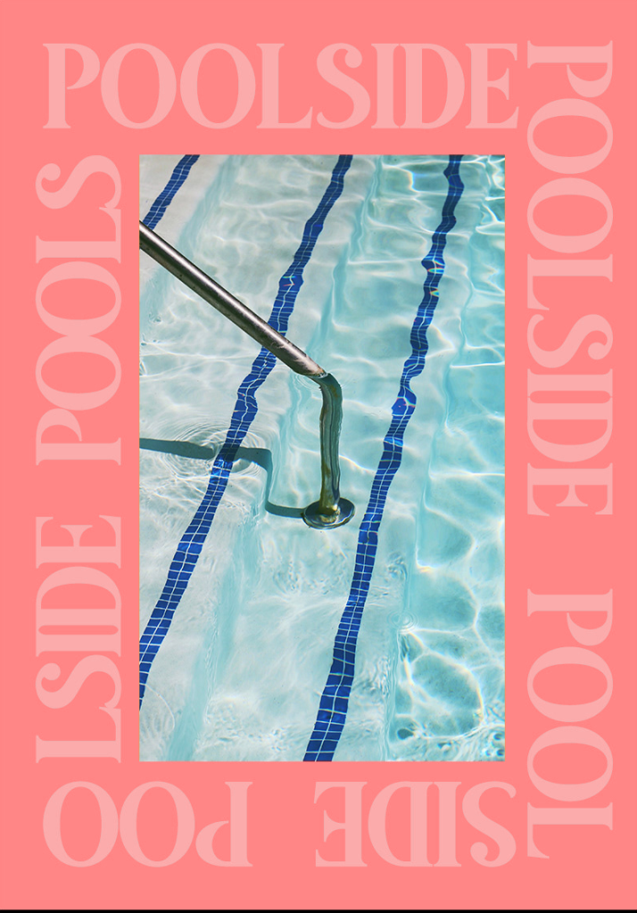
The poster on the left, is my redesign. I didn’t work too hard on this because I felt that the design itself was already very clean and interesting. I chose a red tone because red is the opposite of blue on the colour wheel meaning the colours are complementary with each other.
In addition, the red tone gives a warmer, more passionate feeling to the image which contrasts really nicely with the fresh cold water depicted in the centre. “Because there’s a sharp contrast between the two colours, they can really make imagery pop, but overusing them can get tiresome” a quote from Kris Decker, 99Design. The redesign is stronger because it doesn’t at all takes away from the original concept for the poster.
References.
Misuraca, L. (2020) ‘Ugly’, Behance.net
Decker ,K. (2022) ‘The fundamentals of understanding color theory’, 99designs.com