
Black Lagoon began as a Manga in 2002 later receiving a short animated series in 2006. It is an action focused anime revolving around a small group of mercenaries ‘The Lagoon Company’. The manga and show both contain heavy ‘in-your-face’ action sequences and lots of themes of war, murder and espionage. The font used is titled ‘Compacta Bold’, modified with extra spacing and grainy edges.
Immediately, the type face uses bold capitalised lettering which screams intensity and power, it reflects the series’ strong themes. The spacing of the text is also very important, each character is neatly compacted together. This technique almost forces your brain to read the text quicker which, evidently, extenuates the speed and velocity of the high-octane source material. Each episode of the series is a separate story showcasing one of the many missions The Lagoon Company embark on. Fast and intense is an apt descriptor for both the show and the ‘Black Lagoon’ title card.
Clearly, the title uses multiple different effects to enhance the ‘militaristic’ theme. First, the grainy effect surrounding and overlaying the text is a clear attempt to give the title an almost grunge aesthetic. It is dirty and messy, even more-so when you take into account the bullet holes which plaster the text. The overall tone of the title exudes aggression and violence.
Finally, tying the entire design together. The two O’s within the word lagoon are specifically conjoined together to form somewhat of a ‘lopsided’ number eight. Within it features silhouettes of the four main protagonists and members of The Lagoon Company. Personally, this represents the family aspect of the series. Whilst surrounded by a constant barrage of violence, the quirky cast of characters still find time to associate and form relationships with one another. The silhouettes are intentionally placed within the O’s and have the aforementioned bullet holes situated around them.
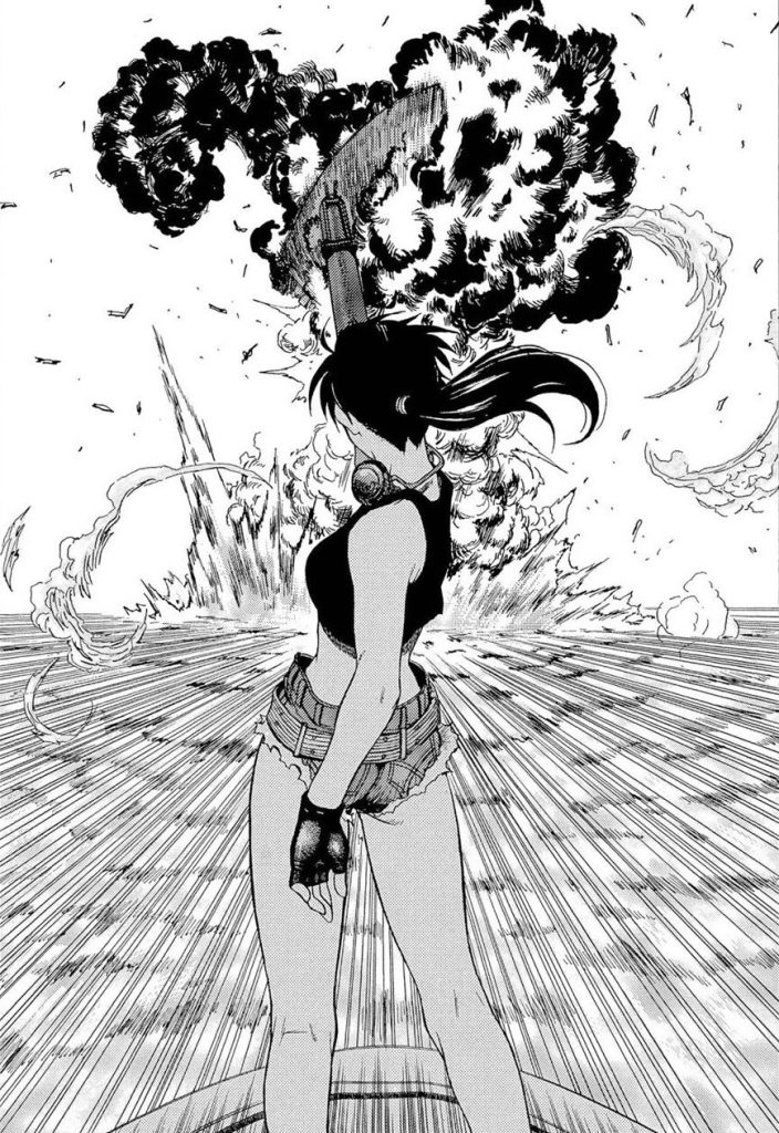
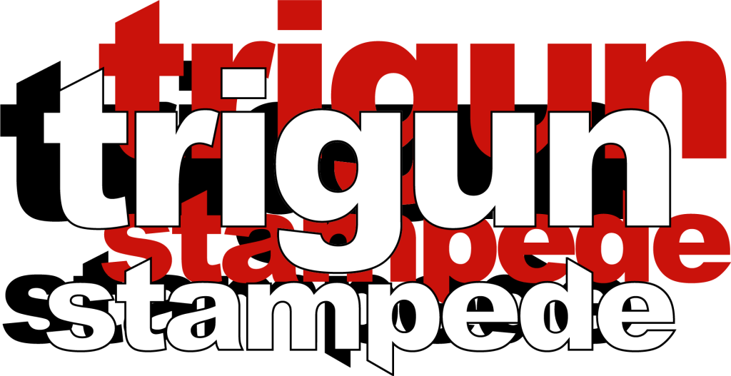
Trigun Stampede is a 2023 remake of the original 1998 anime Trigun. Trigun is a retro space-western with a very 80s-90s pulp overtone. And it is immediately made obvious that the Trigun Stampedes title-card doesn’t reflect this theme in any real format.
The first problem that strikes me would be the wide spacing between the lettering. Unlike the Black Lagoon title-card, this slows the reader down making the word look longer and more drawn out. A 2020 study by Sebastian P. Korinth and others discovered that “wider character spacing produced robust effects of shorter fixation durations that did, however, not translate into reading rate gains. On the contrary, reading rates were slowed down”. The spacing of characters directly represents the tone of its subject.
Another big issue would be the stylisation of the first T. while i think the design of the letter looks good, it isnt reflected on the opposite side of the word. The N at the end of Trigun, could have been expanded and tweaked to match the opposing side. Instead the title-card looks too heavy on the left side.
Overall, the design feels generally uninteresting and bland, considering the subject matter.
I was heavily inspired by 80s-90s cartoons and anime for this redesign, I wanted to keep the angled lettering like the original logo. So, I altered the font I chose (I also added the colour red as a shadow behind the title because the colour red plays a large roll within the overall aesthetic of the show itself).
I think my title-card succeeds where the original fails because it is more interesting and stands out with colour. Also it suites the original theme for the trigun franchise and source material.