Brief.
To present a development research blog that demonstrates my ability to use the principles of User Experience (UX) and User Interface (UI). Whilst researching the crucial elements of a festival and following that up with creating a conceptual festival of my own choosing. Then, designing a prototype for a website and companion app that will be used in conjunction with the event.
Festival Idea.
A Power Metal themed festival. Power Metal is a popular sub-genre of Metal, often involving themes of war, fantasy, history and battle. A Power Metal festival should include the aesthetics of each of these themes and be advertised towards fans of the genre and fans of said themes. The website and companion app for the festival must also take these aesthetics into account whilst still being easy to read and understand.
Audience.
The audience of anything can be hard to determine. To attempt to understand the audience of what would be a Power Metal Festival, using reddit was the best course of action. Reddit allows for users to post questions and discussions within groups (subreddits) of different topics. To understand the audience of a Power Metal Festival, the subreddit ‘r/powermetal’ is a the best location to find answers.
Posting a detailed post onto the subreddit gave a variety of detailed and informative answers;
“University work – Understanding the audience of my Power Metal Festival concept.
I study graphics design, I’ve been given an assignment to conceptualise a festival and create a website design based around the promotion of said festival. My immediate first thought was a Power Metal Festival. I love all sorts of fantasy styled design and I’m a big fan of bands like Kal-El and Eternal Champion.
So what I need from you r/PowerMetal. Is basically what kind of people you are. I need to build 6 ‘personas’ of the different kinds of people who would attend my Festival. All I really need is likes, dislikes, age etc.
Of course nothing doxxing or too personal. Although I’m very sure you’re all aware of that.“
The request posted on reddit by Harvey Na’ama.
Many answers were received, detailing peoples personal information such as age, hobbies, likes, dislikes and other facts about themselves. I will be using this data to create 6 personas showcasing the types of people expected to attend such festival, and use the website.
The images below represent the personas of the expected audience. All data collected and adapted from the data gathered within the reddit post. All images taken from Alamy and reference below.
Alamy (2024) Images Homepage. Available at: https://www.alamy.com/stock-images/ (Accessed: 09 03 2024).
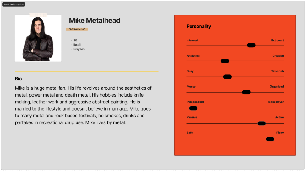
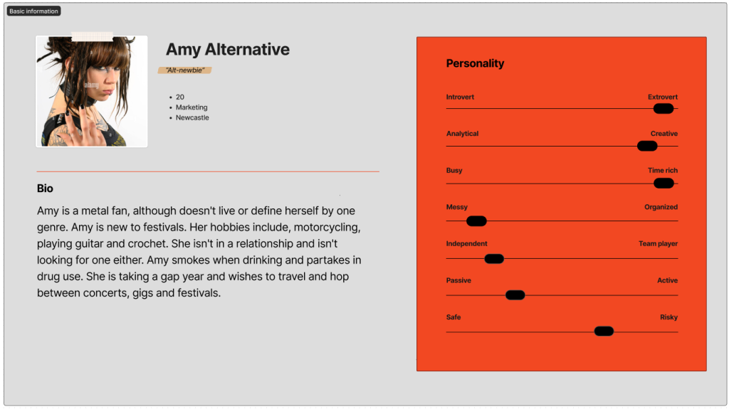
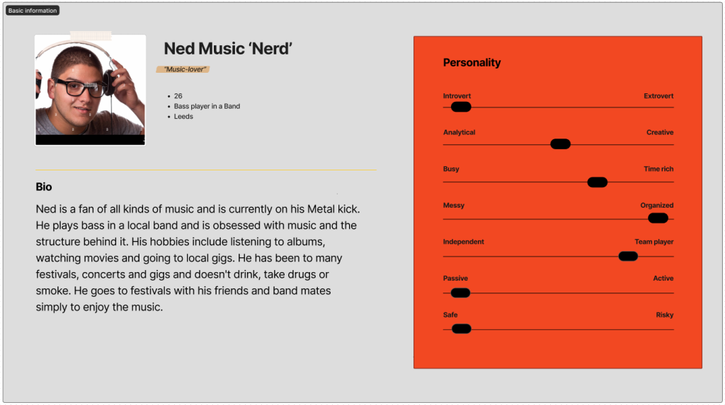
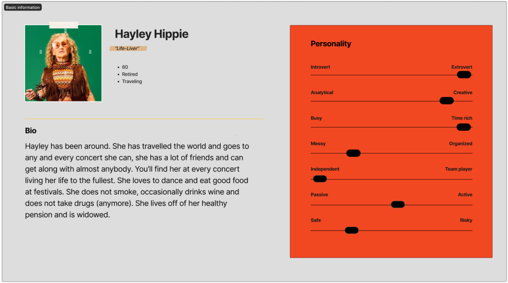
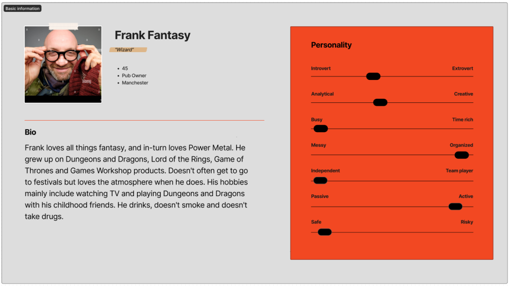
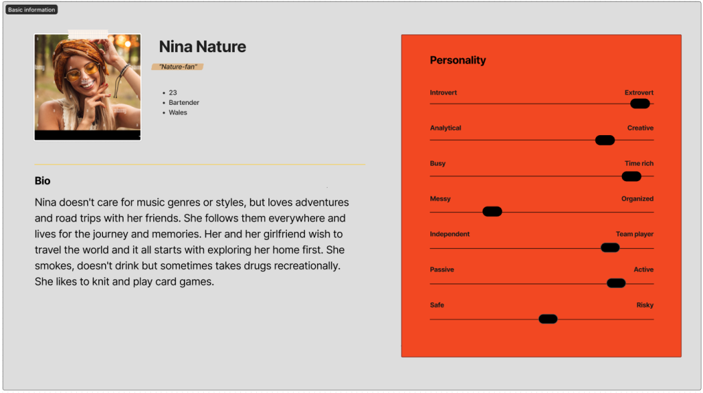
These personas represent the audience and attendees of the festival, and potential users of the site. Stakeholders will also be taken account of.
Other stakeholders will be the investors, the festival runners hiring for the website design, board members and anyone not directly involved in the development of the site but rely on its success. The audience and the stakeholders will assume the site to be 100% functional, include segments for purchasing of tickets, a map of the premises, a clear view and aesthetical representation of what the event stands for and embodies. Success will require these ideals to be perfectly represented and working.
Users Needs.
Due to the diverse range of audience. The website requires a simple and easy to understand layout. Bold text, bold buttons, bold colours. This site needs to be easy for an eighteen year old and a 60 year old to use. There must be obvious and clear sections dedicated to important information like tickets, pricing, a map of the grounds, terms of service, ticket request page (for reporting bugs, issues and asking questions to a support. Success in the site is clear and easy to access pages and a positive response from users and a lack of bug/ issue reports.
Accessibility.
Ensuring website accessibility is extremely vital to a site. Accessibility concerns include visual impairments, motor disabilities, and sight limitations. Adding features such as captions for images, clear call to action designs and clear, easy-to-read content addresses these needs. Prioritizing website accessibility ensures inclusivity, enhances user experience but also prevents user attention to the site from dipping and resulting in the loss of users.
Primary examples of strong festival design.
Immediately, the site for the ever popular and ever growing ‘Boomtown’ stands out and will be a primary accessibility and layout inspiration.
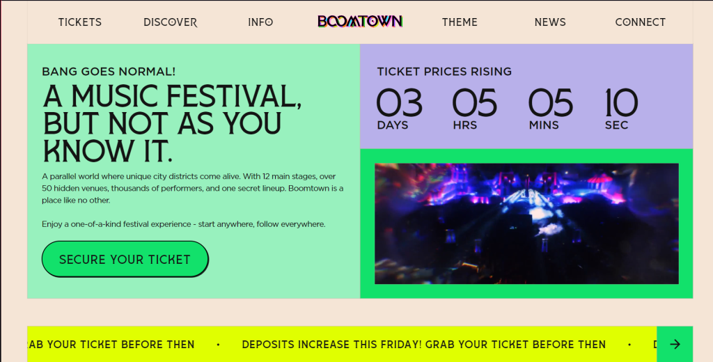
Boomtown clearly shows where to buy tickets, where to find information about the festival, news and price changes, and where to contact the company via the ‘connect’ button.
On the other hand, the Tomorrowland festival is a poor example of quality accessibility.
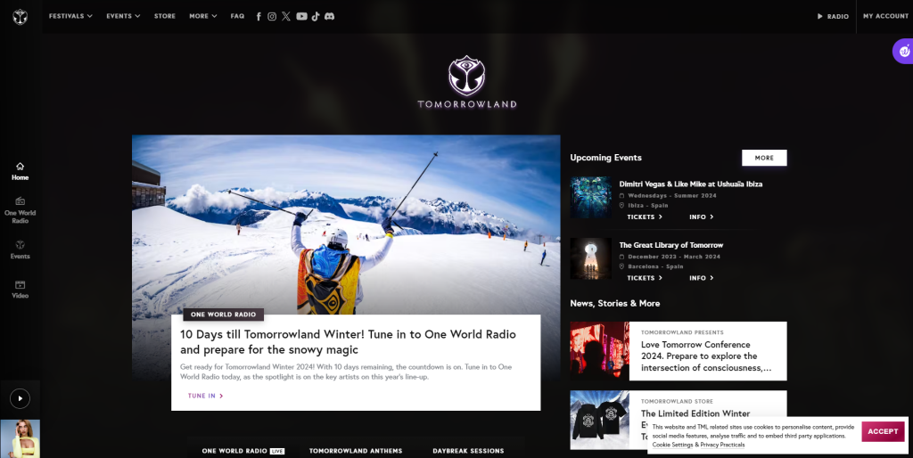
The site has extremely small text with too much information thrown at you immediately. Instead of letting the user decide what they want to see, it gives you too much all at once.
In essence, the site must be quick. The goal is to produce a site that users don’t have to spend more time than they are willing to spend on. To ensure that all users can easily purchase their tickets and experience the site the way they wish to.
Journey Map.
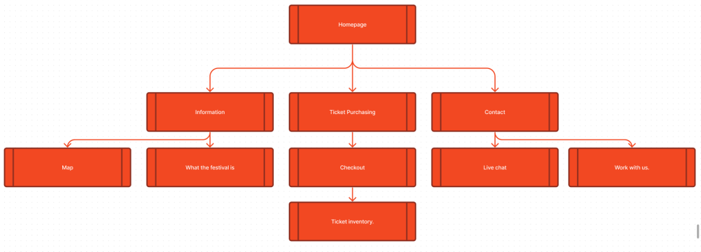
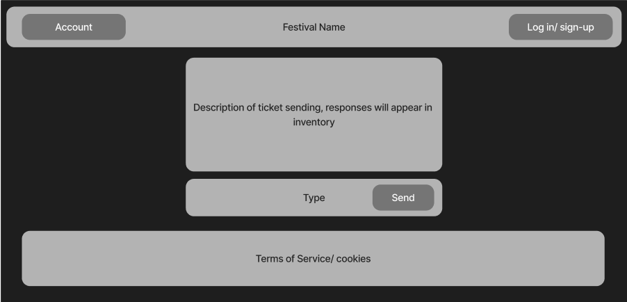
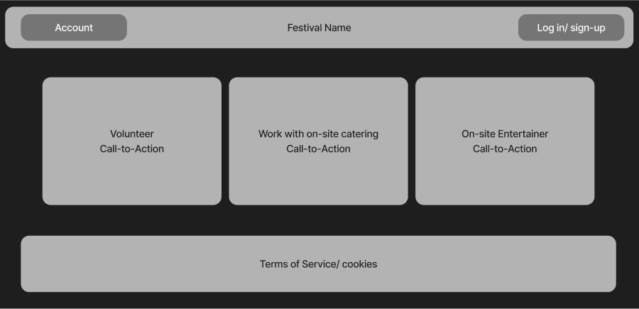
This journey map represents the flow of the site, how users will get from point A to point B via the call to action buttons. The site should be quick and have a clear route for users to take. The homepage will feature 3 main buttons. Information, ticket purchasing and contact. These buttons will be the core to the webpage with the goal to be able to fit all three buttons onto one page, with little to no scrolling required. From information, you can view the map of the grounds showing Access points, stages, toilets and other on-grounds venues. You will also have access to a description and small history to what the venue is and what it is about. From ticket purchasing, you can choose the type of ticket you wish and checkout, which will give you access to your ticket inventory. This will show how many tickets you have bought, what you have access to and how long you will be staying. From contact, you can access the live chat, where you can send tickets and speak to the support team. You also have access to work with us, which will show different ways of applying to become a member of staff, volunteer, on-grounds catering, entertainer, etc.
Low fidelity UI prototype.
First, to understand the process and organization of a low fidelity prototype. I replicated the mobile and web versions of the Boomtown website. This allows me to grasp the simplicity and requirements of creating a low fidelity version.
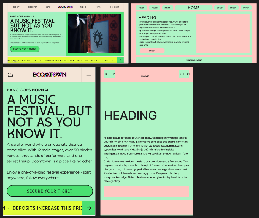
So when creating the low fidelity prototype, I tried to mimic the simplicity of the Boomtown site.
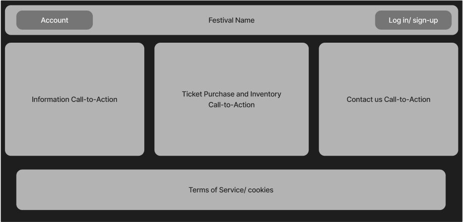
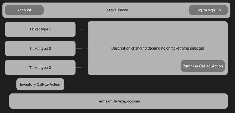
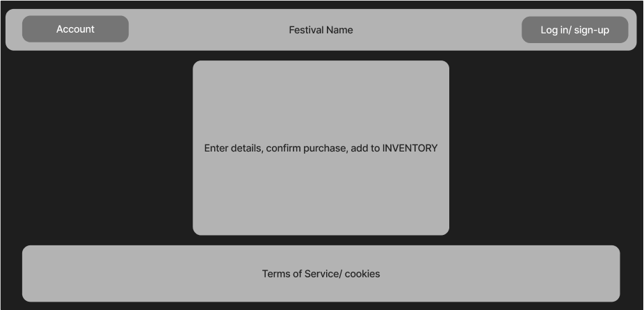
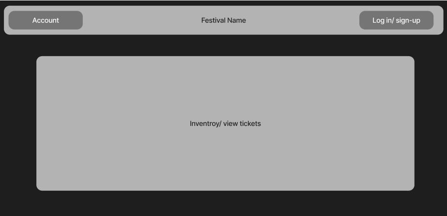
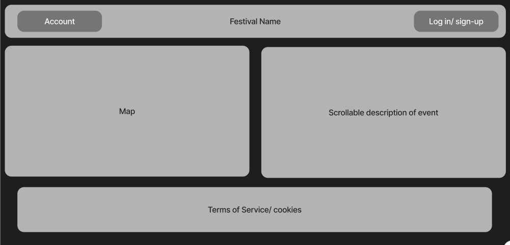
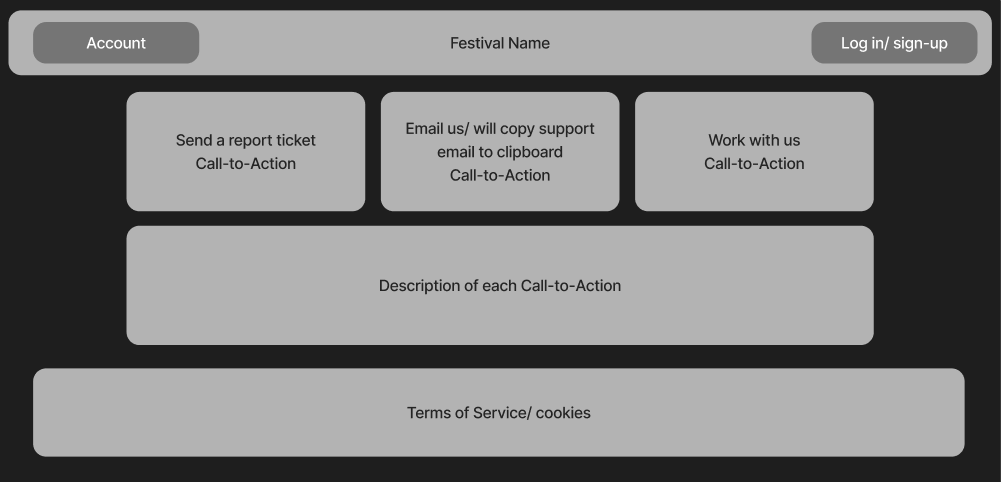
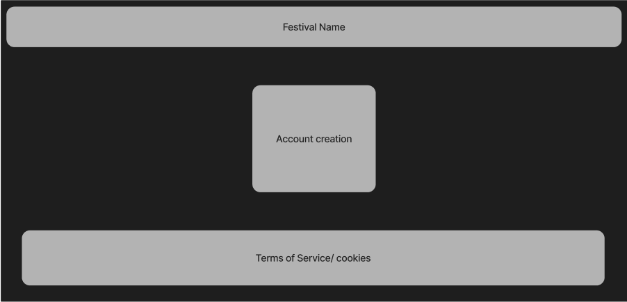
Above are images containing, each required page for the site, represented as low-fidelity prototypes. These do not represent the final outcome and contain as little information as possible to prevent confusion and dated design.
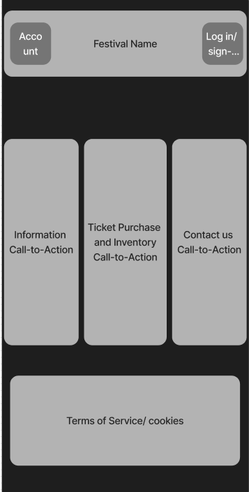
Due to the simplicity of the site, the goal is that the mobile version will be a ‘squashed’ version of the initial webpage, allowing for seamless sizing.
The goal overall for the interface, is to allow all users to get exactly what they need, without the interface being overwhelming or intrusive, for example, somebody who wishes to contact us for a desired specific reason, can do so. As well as users who simply want to order tickets, can do so as well.
The call to action buttons will take you to precisely where the say they will, and to return to homepage, you simply click the festival name. Or, go back in the browser. Feedback, will be received via the submit ticket report, and testing.
The Problem Space.
The website will be designed to be as least-overwhelming and simple as possible. Without preventing users from having a lack of tools. The audience of the Festival is so varied and different, that the site needs to adhere to these different backgrounds and specialities.
Some problems users could experience may be: server-side site crashes, bugs resulting in call to actions not working.
Some problems that users would experience if the site doesn’t take account for may be: colour clashing preventing readability, small or unreadable font, unclear titles of buttons.
The map is in place to ensure users can understand the facilities and event locations. The description will allow users to understand the event time and other crucial event information, the submit ticket section allows users to send their problems directly to the site dev.