Typographical name logo:
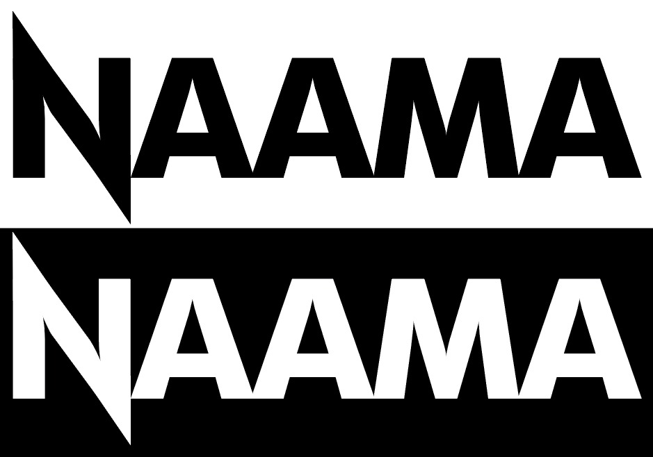
For each typographical design I wanted to ensure I used a strictly black and white format. To allow for the design to be used universally on any webpage or other form of presentation. I also wanted to make sure each design was simple enough to be replicated and remembered whilst still being somewhat interesting. My first thought for the first attempt was to take advantage of the ‘spikiness’ of my last name (NAAMA) each letter when capitalised forms a triangle and the spike idea also works very well with my general art style and interests which is generally dark, edgy subject matter. I instantly really liked the look of the N being the standalone letter with spikes and would later adapt it into its own conceptual logo.
For the second attempt, I chose to draw my name rather than use the standard text tool or shapes. I wanted to significantly differentiate this logo whilst still keeping my simple, black and white format. Again, I took advantage of the ‘spikiness’ of my name. Drawing the N large, and the following letters in a single zig-zag motion which gives the logo a feeling of interconnectivity whilst being easily legible. I also decided to add the apostrophe in my name this time around. Most people in my family avoid this to make the name seem more English. Usually I avoid using the apostrophe because I’m lazy or because I think that stylistically it doesn’t suite the design, like in the first attempt. Overall, I can see myself taking advantage of these designs in future projects and promotional work, although I think both designs can be refined slightly. With more efficient adobe illustrator usage once I become more comfortable with the program.
Conceptual name logo:
Keeping with my interest in dark and edgy style. I wanted to incorporate something which would say that without being viewed as cringeworthy or trying too hard. I chose a sword because it fit nicely within the my spiked N from the Typographical name logo first attempt, and it tells the viewer my style as well as interests. I love all things fantasy and medieval so the idea felt like a must. I really like this design and can see myself taking advantage of it throughout my university experience. Originally, I simply added lines connecting the corners of the N which then gave me the idea to add a sword because of the sharp edge which the lines created.
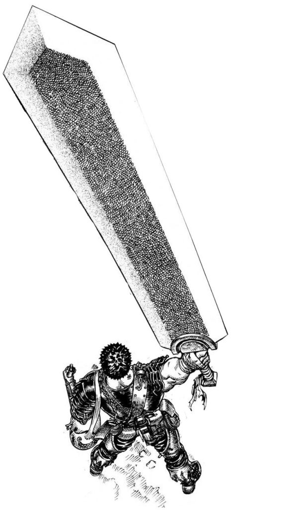
For the second attempt, I wanted to use both of my initials despite usually preferring Na’ama being my name, which I don’t tell people often. With this logo, I took huge inspiration from the manga Berserk where the protagonist Guts wields a thick sword made of iron too large for a normal man to wield. Berserk is by far one of my favourite piece of media things of all time. So inspired by such, I designed this logo to reflect his sword with my initials almost carved into the edges. Personally, this design doesn’t stand out to me as much as the first attempt although I think it is still a good one to show off and present since it encapsulates a huge part of me in a very simple design.
Overall, both designs represent me and my interests however I’d like to try move away from the idea of swords despite me clearly having a close love for them.
Self promotional cover designs.
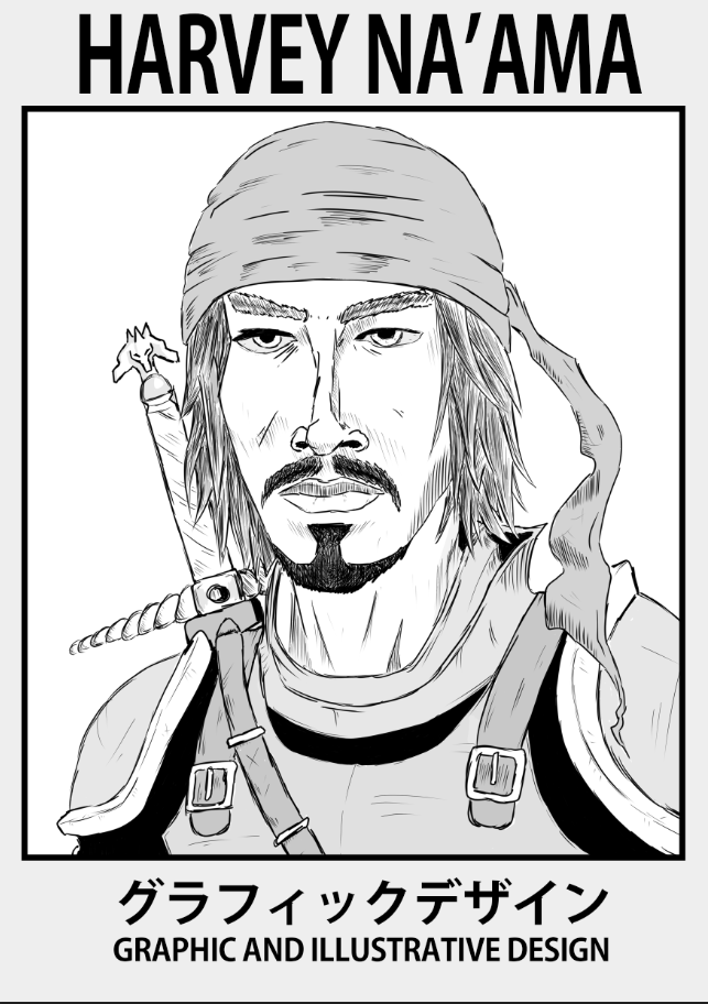
My first attempt was, again, heavily inspired by the manga Berserk and its authors (Kentaro Miura) art style although it is comparable to a manga art style as a whole, the Japanese text roughly translates to simply ‘graphic design’. I wanted to show off my illustrative skills which I have practiced my whole life although more-so since starting college and reading manga. I’ve loved drawing since I was a child but growing up I simply fell out of love with it. I wanted this cover design to again reflect my interests and decided the best way to show that was to portray myself as a classic ‘dashing rogue’ in the manga art style. I am very pleased and honestly impressed with myself with the outcome since I am not totally used to drawing with a digital tablet. But I picked it up quite quickly and managed to create something I was proud of. The border and text was also directly inspired by manga and their inner chapter starters.
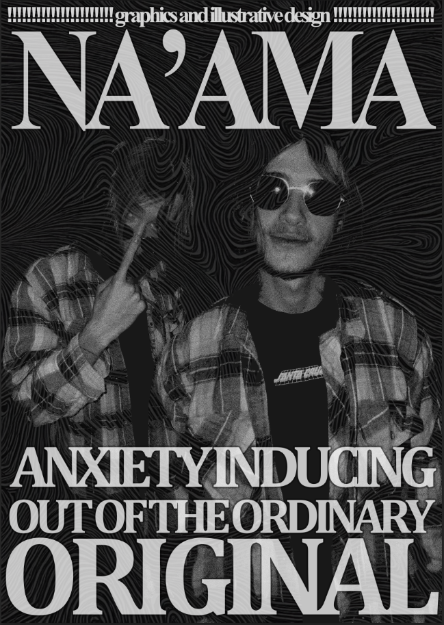
My second attempt was initially going to be another illustrative design, although due to being ill and university closing for Christmas I didn’t have access to the a drawing tablet. So I chose to go with an alternative design, inspired by rock, metal, grunge concert posters. I took advantage of bold lettering and grey tones. As well as a Damascus steel background blending into the images of myself. I don’t particularly view myself as anxiety inducing, out of the ordinary or very original although, I think a lot of my artwork can reflect that especially my next two pieces.
Photoshop self portraits.
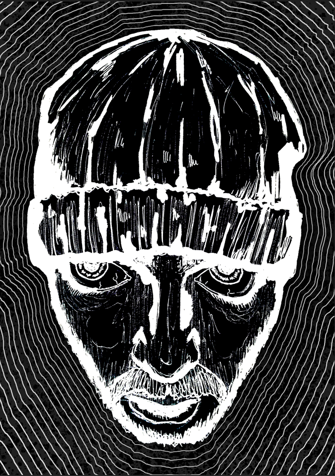
This first portrait was my way of representing the chaos and lunacy that rave and concert culture has. I started by taking a picture of myself with the 0.5 lens on my iPhone. Which gave a really interesting and somewhat comedic perspective of my face. However, it also made my eyes look huge in comparison to the rest of my face. Really exaggerating my eyes and the blood vessels within them.
I don’t necessarily think there is much to say about this piece and really it speaks for itself, I drew the image of my face with ink pens and reversed the colours creating a bright piercing white, and added lines to reflect the the acid, psychedelic connotation of raves/ concerts. I will add however, I really like how my eyes don’t appear to be looking directly at the view but ever so slightly passed you. As the I’m reacting to something else I’m seeing.
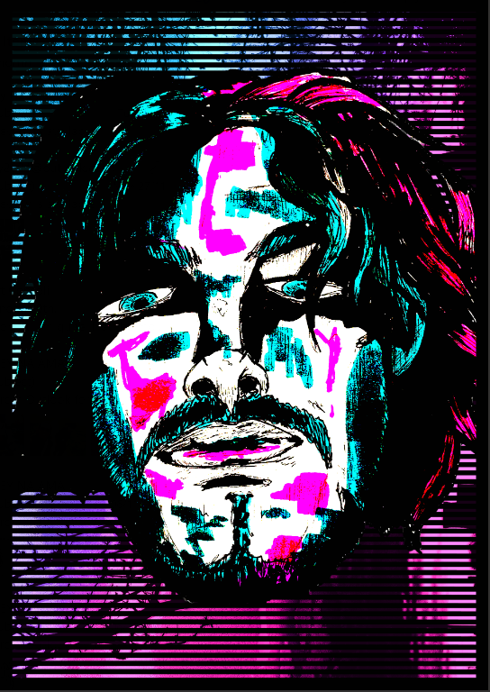
I wanted my second attempt to reflect the look and feel of the original whilst incorporating colour and more vibrancy.
Again I used an ink sketch of myself. And a picture of a sunset I had taken for the background, which I flipped 90 degrees and adjusted to fit the almost vaporwave/ 80s style I was going for. I don’t think this attempt is as artistically interesting as the first, however I am happy I was able to experiment more with colour and designing in a different style.
I was overall, pretty happy with the outcomes of both designs although I think in future I will go for digital art over physical.
Illustrator Self Portraits.
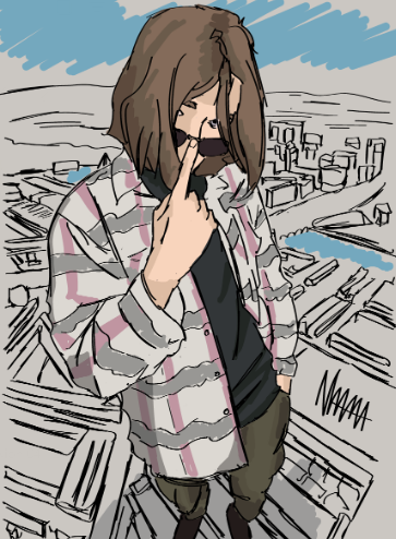
This first attempt, was my first actual attempt at using a digital drawing tablet, I’m not totally pleased with this or the second attempt. But starting here, I think my shading and colouring was well done on this first piece however I wish I had used finer linework on my self as well as the background, which is simply just a rushed city scape. I wanted to give the same feeling that the original image I used as reference gives me. I feel like I look larger than life and on top of the world, which is why I chose to place myself on top of a city. I also think the angle accounted for that really well.
Though, I did just trace the original image, copy the colouring, match the shading and added no real artistic flair to the design. So in future I want to refrain from doing that again, unless I make a real effort to alter the image I am tracing.
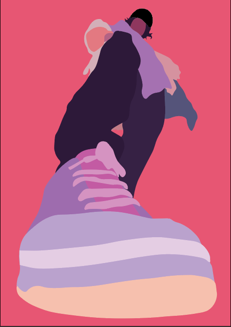
Second attempt, I wanted to experiment more with illustrator in this attempt. I went for a more abstract style with solid colours and simple shapes.
Like I said with the previous attempt, I wasn’t too impressed with this design. I again, don’t think there is anything too interesting or eye catching about it, I like the colours used and I think I did a mostly good job at using the correct colours. However, I still don’t see much keeping this design afloat. I think in future I’ll stay away from anything abstract or overtly simple as it doesn’t necessarily intrigue me. Again, this was a very early attempt at Illustrator and I will commend myself for trying something a little out of my comfort zone but my point still remains.
Overall, I think I prefer the use of illustrator more for typographical designs and some illustrations here and there. But considering my interests and general art style I’ll mostly be using photoshop for large pieces of work.
Kentarō Miura, Deangelis, J., Johnson, D., Nakrosis, D. and Studio Cutie (2019). Berserk. 1. Milwaukie Or: Dark Horse Manga.