Conceptual design can be described as an image or design that the audience is supposed to understand as a symbol for something else.
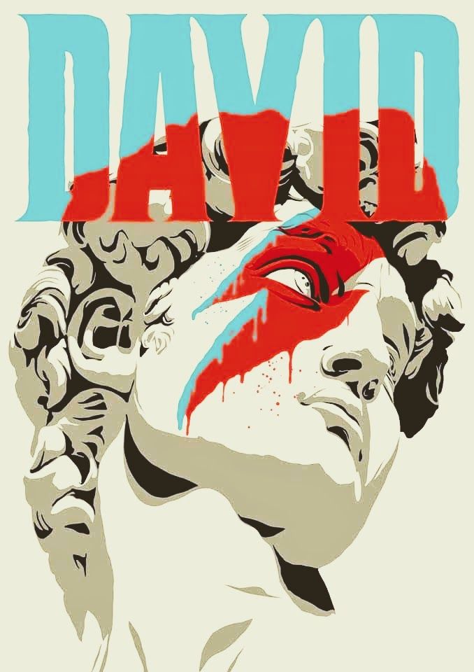
My good example, instantly became this ‘David’ poster. Clearly showing Michelangelo’s David don David Bowies iconic red and blue lightning bolt. There isn’t any clear important messaging being displayed with this image, though that doesn’t take away at all from the symbolism which it exudes. First, Michelangelo’s David is highly regarded as one of earths true masterpieces and represents not just David as a character but humanity itself. David being the very same David who fought and defeated Goliath with a mere slingshot.
On the other-hand, David Bowie was a late 60s to 2000s pop icon. Beloved by millions and mourned by more in 2023. David Bowie quickly met stardom in his early life and released 26 studio albums throughout his life. The combination of both David’s, could symbolise the quick successes both people faced David conquered Goliath and David Bowie conquered the music industry.
This is a good example of conceptual design, because it can be clearly perceived by the audience that the designer is making a specific statement comparing the greatness and the iconography of David Bowie to Michelangelo’s world renown David. It also uses vibrant and blocky colouring really allowing every detail to pop, which could in itself be a reference to 60s-80s graphics design culture. Inspirations from the likes of Andy Warhol and Keith Haring.
The underground of Sacramento holds the home of Death Grips. Iconic in their own right, being highly experimental and industrialist. For this poster, all which needed changing for me was the centre artwork, while its fantastic and I think definitely causes the audience to ask questions, that doesn’t inherently mean it means anything at all. Also, I want to create work of things that I am a fan of.
My first thought was to be as literal as I could, similar to the previous example ‘David’. I didn’t want the audience to have to think too hard and I didn’t want to either. A death grip is a word with multiple meanings however I wanted to ignore them and focus on the individual words being death and grip. To begin, I sketched a skull being the most obvious depiction of death I could think of and started drawing my own hand in a few different poses before finding one I liked. I combined the two showing the hand now decayed and ‘zombie’-like claw at the eye sockets of the skull.
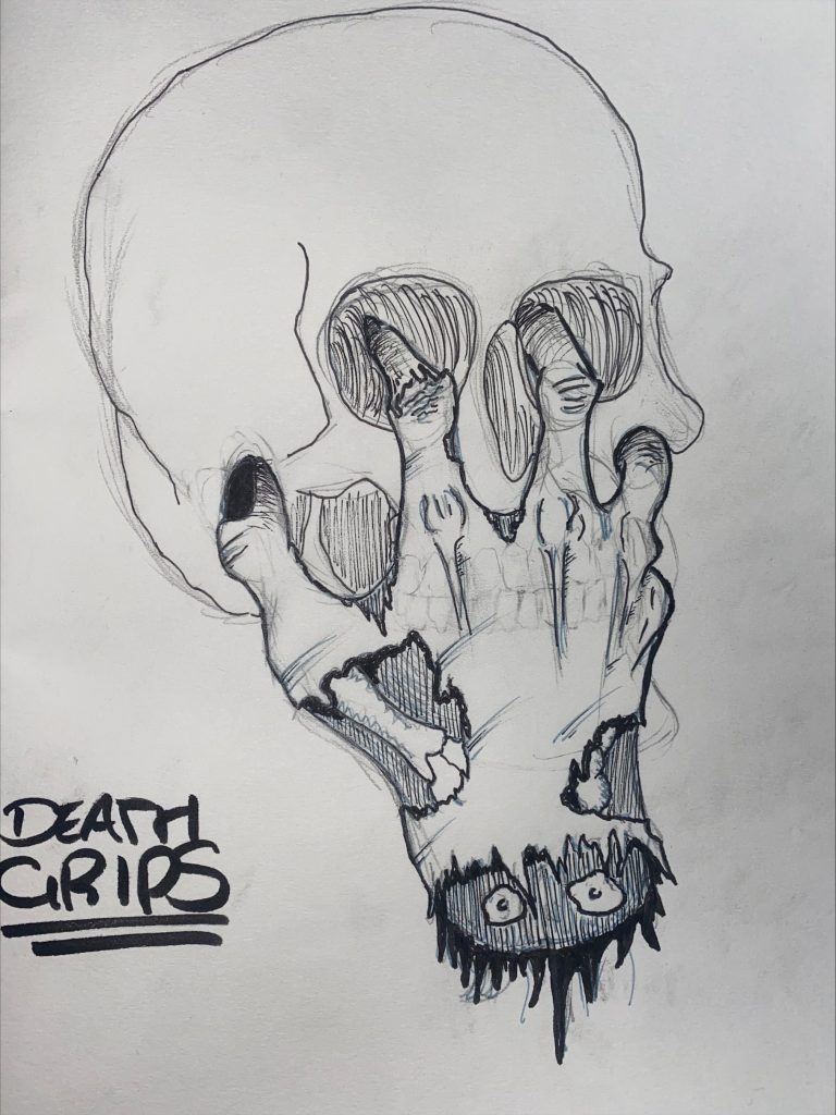
My design portrays a stronger example of conceptual design because I’ve taken Death Grips name and adapted into a design which the audience can somewhat solve and feel rewarded without being too vague. Whilst still maybe keeping the intrigue portrayed in the original. In the future, I’d like to return to this design and expand on it for my own final poster designs.