Composition is crucial to advertising, good composition can allow the audience to read the advertisement in the exact way the designer intended. Good composition also has the power to pull the audience in the well placed, eye catching graphic design. Primus, and their design team, had a stranglehold on this idea within their poster design.
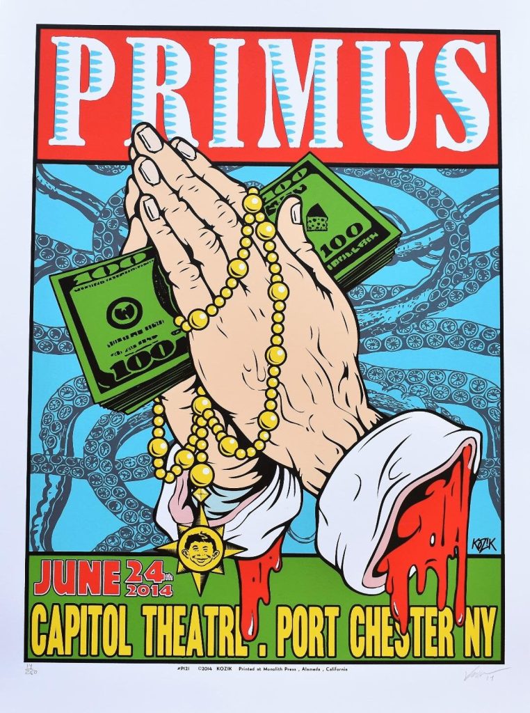
Primus debuted in 1989 El Sobrante, California. They are a strange, bass heavy, progressive rock band. The first image is a poster from a New York Primus concert in 2014. Ignoring all but the composition, the immediate design choice that sticks out to me would be the graphic of praying hands holding 100 dollar bills. This being the clear focus of the artwork, being in front of both the bands name, and the date and location. This could be viewed as some sort of political statement or message especially considering the bands history with that sort of thing. However, compositionally the centre artwork stands to catch the eyes of the audience. Reeling their line-of-sight toward the rest of the poster.
The top text band name ‘Primus’ is big, bold and spans the whole top section of the poster, clearly informing the audience of who they are. Just below the band name and behind the centre artwork, is the background. Being a simple, lightly saturated group of designs as not to take away from the vibrant rest of the poster. Finally the bottom text of the poster which is neatly tucked at the bottom of the image underneath the leftover residue of the centre artwork, the las piece of information you see of the advertisement.
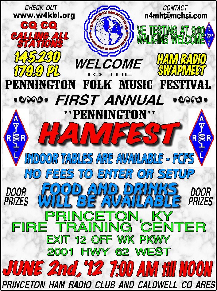
The image shown on the left is an advertisement for a folk/ country festival, it is hideous. The poster is filled with misplaced nonspecific information which is scatter across the entirety of the page. The most eye-catching feature of the poster is the bold, red ‘hamfest’ in the centre, however, its a struggle to understand where you’re supposed to look next.
The poster makes no attempt to guide your eyes to any key information and instead just gives you it.
My recreation concept was made in specific reaction to the composition of the primus poster.
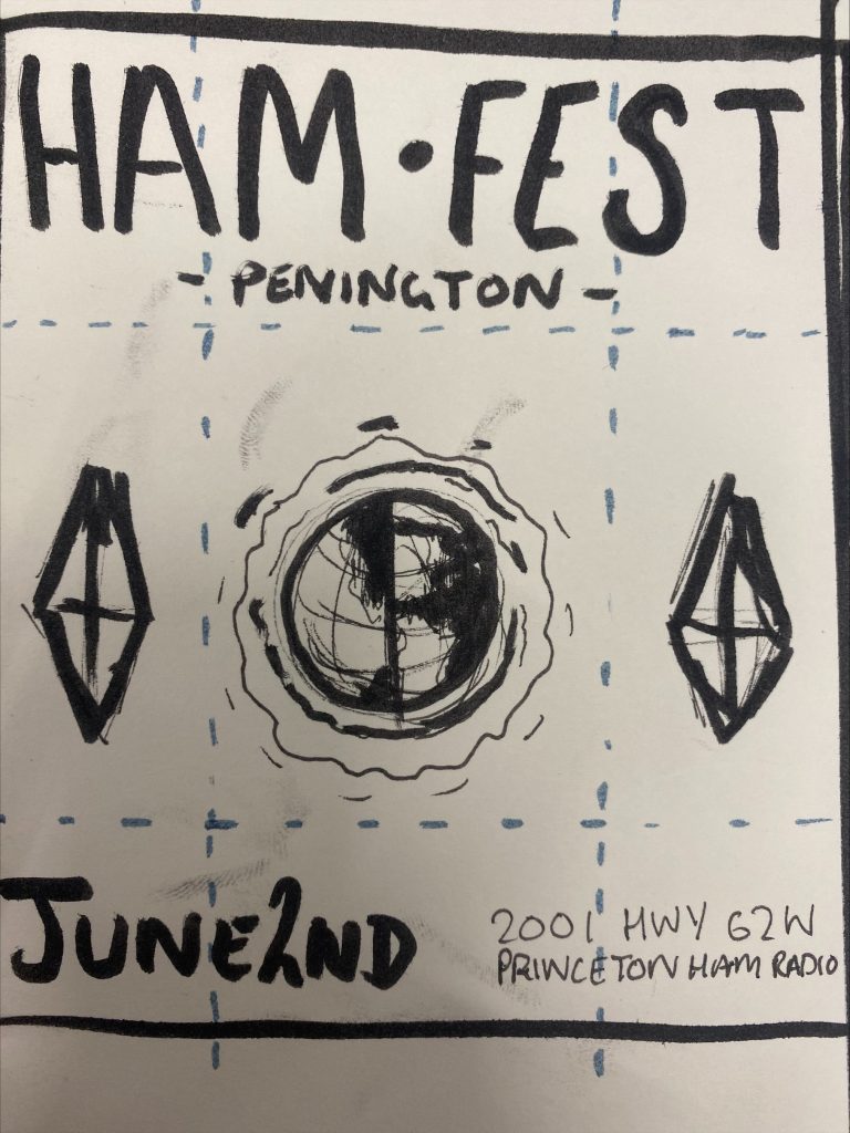
I decided to sketch rather than digitally design this recreation because for composition colour and smooth vector graphics are secondary. I also made an effort keep the images used in the original poor example whilst gutting any information I deemed useless. An effective poster design needs to more intrigue whilst informing the audience at the same time, so quality over quantity for information. I also made sure the event name was right at the top of the poster ensuring the audience knows exactly how to follow the poster, as well as exactly what the event is called.
Likewise to the Primus good example, I added the date and location to the bottom of the poster as it is the last piece of information you need.